
Case Study
Tamooz Marketing
Pharma
Communications
Global pharma visuals with regulatory precision.
Case Study
Tamooz Marketing
Global pharma visuals with regulatory precision.
Project Overview
As Senior Art Director at Tamooz, I led creative execution across multiple global pharma accounts in some of the most regulated marketing environments on earth.
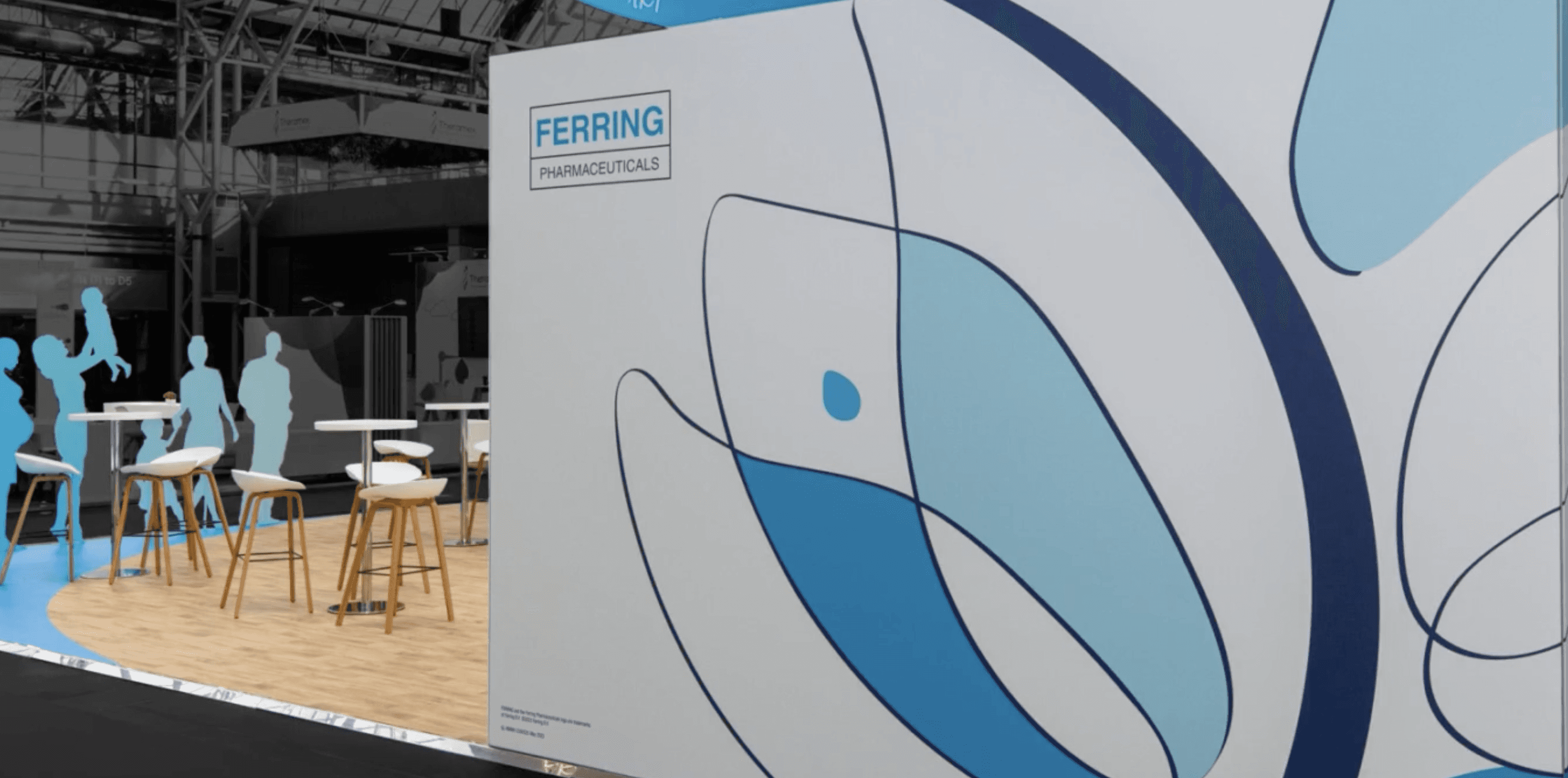
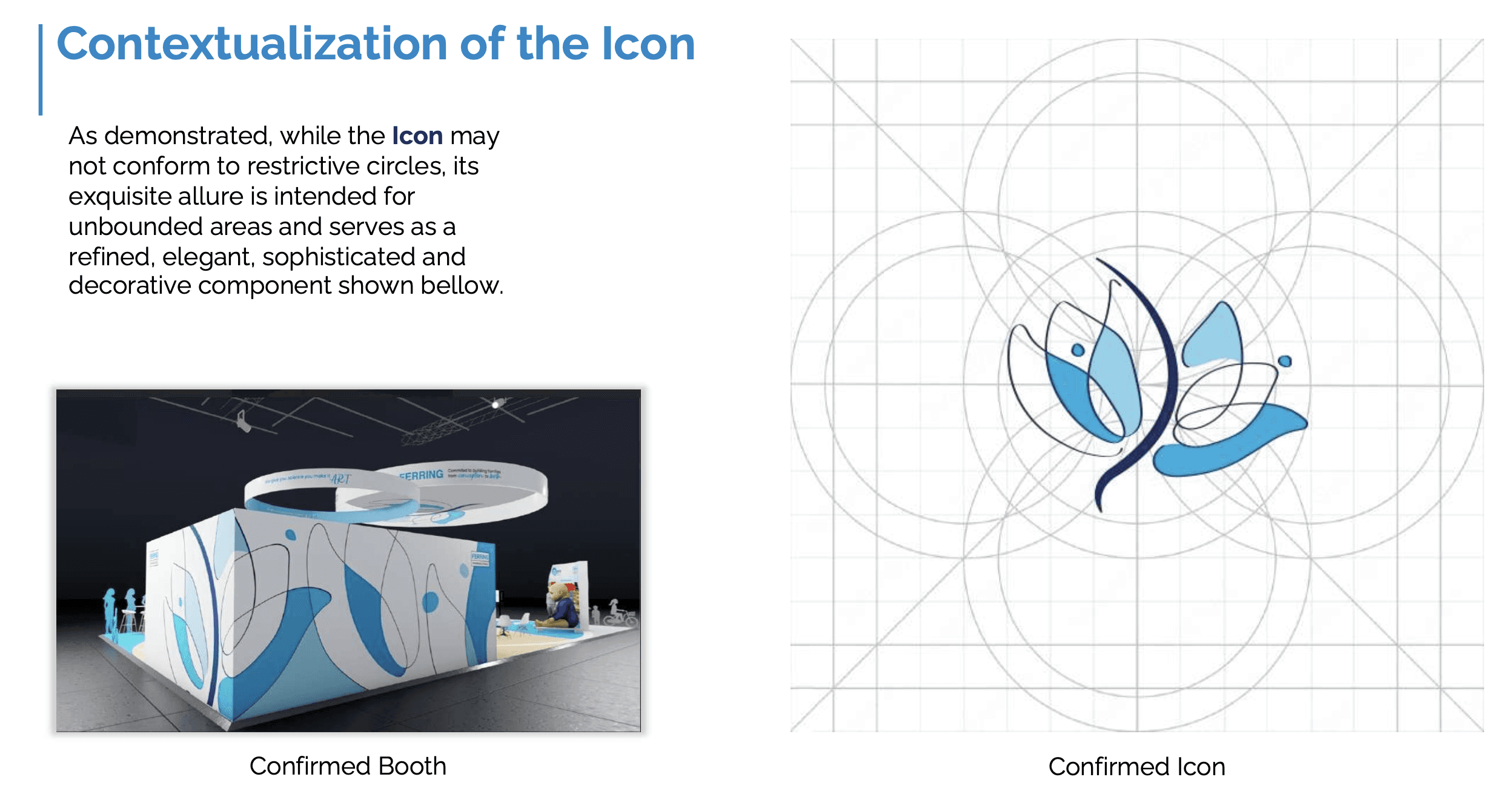
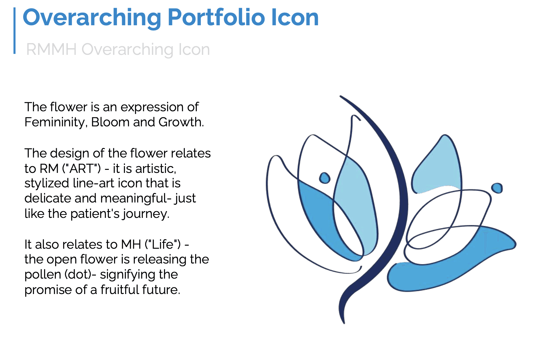
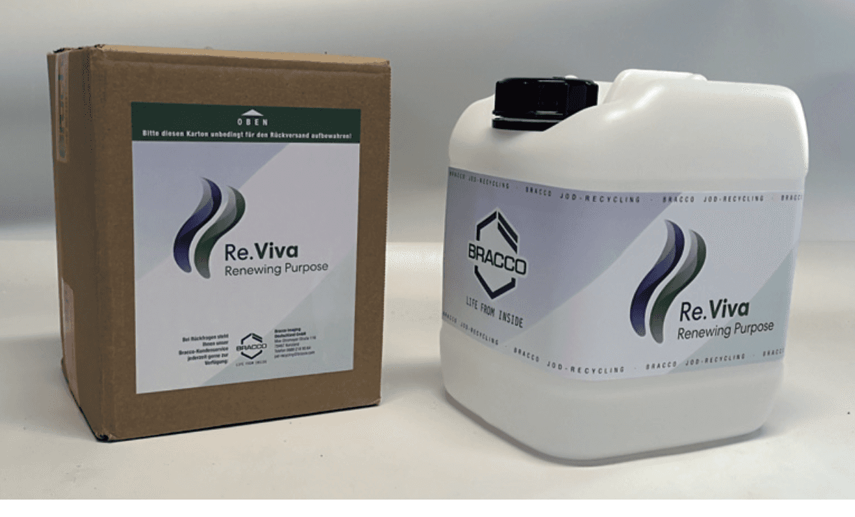
From sustainability packaging for Bracco to a full identity rebrand for Ferring's fertility portfolio, my focus was clarity, trust, and cohesion.
I unified creative direction for two major pharmaceutical clients — developing brand systems that balanced medical accuracy, regulatory precision, and human-centered design.
Objectives
Approach
For Bracco, I developed sustainability-forward visual assets that remained logistics-friendly and globally recognizable. For Ferring, I led a full rebrand focused on warmth and clarity — crafting a unified visual identity for a suite of fertility products.
In both, every design decision balanced medical accuracy with emotional relevance.

Collaborating on brand systems across regulated pharma assets
Good healthcare branding should feel like a hand on your shoulder. I wasn't just designing for the eye — I was designing for the moment someone says, "Okay, I'll try this."

Outcomes
Ferring's rebrand adopted and deployed across 18+ global markets.
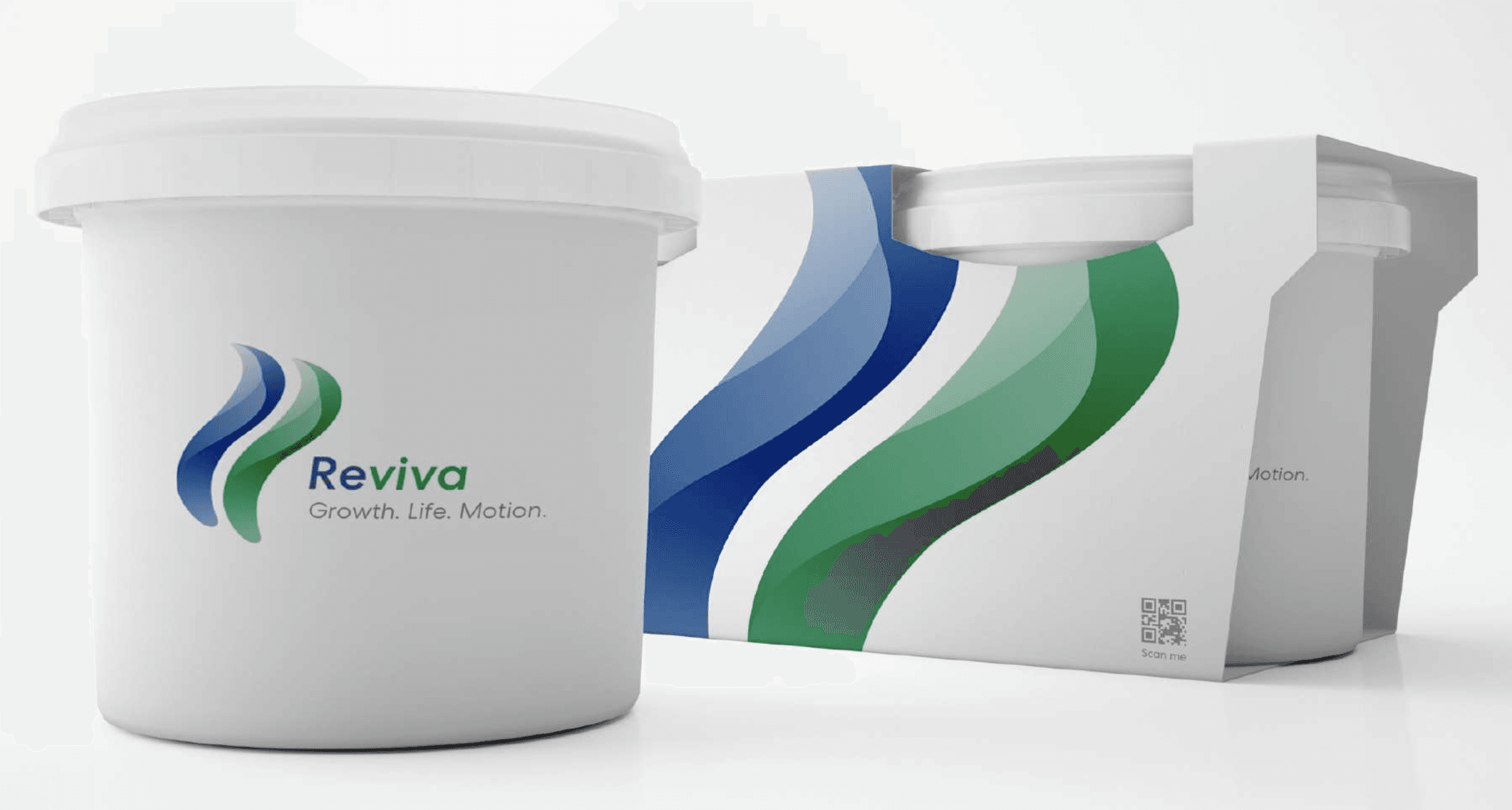
Re.Viva label for Bracco improved program recognition.
Assets deployed across digital, packaging, and trade globally.
Even within the strictest boundaries — legal, medical, procedural — there's still room to move people. What emerged wasn't flashy, but it was honest: design that could hold both the science and the soul.